im curious what app you use? i’m trying using satnogs-waterfall-tabulation-helper , . i try to change the colormap other than viridis but nothing happens.
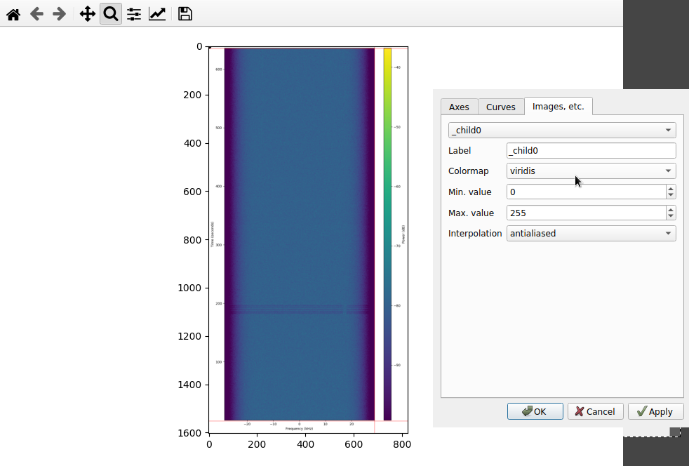
I’ve used GIMP. I hadn’t changed the colormap but playing with the color levels.
1 Like
here mine:
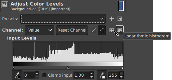
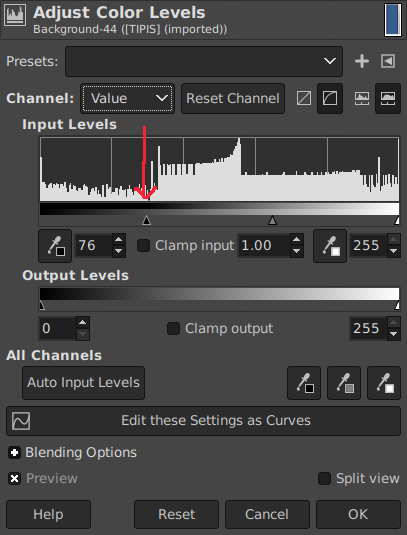
- download the waterfall png image and open with gimp
- click colors - levels…
- choose Logarithmic histogram
- move the left slider (input levels) until near the first higher bar
- back to the waterfall, it should more clear.
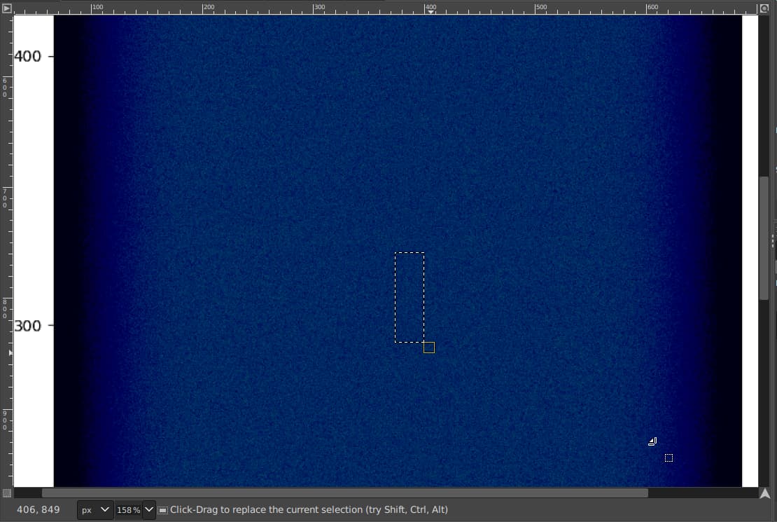
- look start from 300s (the picture here is not clear, because the image quality reduced when i upload here)
everybody should try. lol ![]()
1 Like
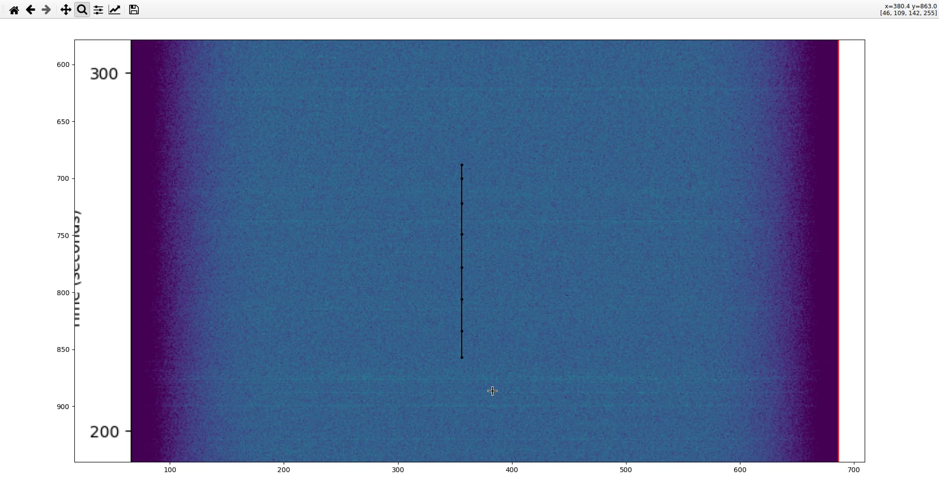
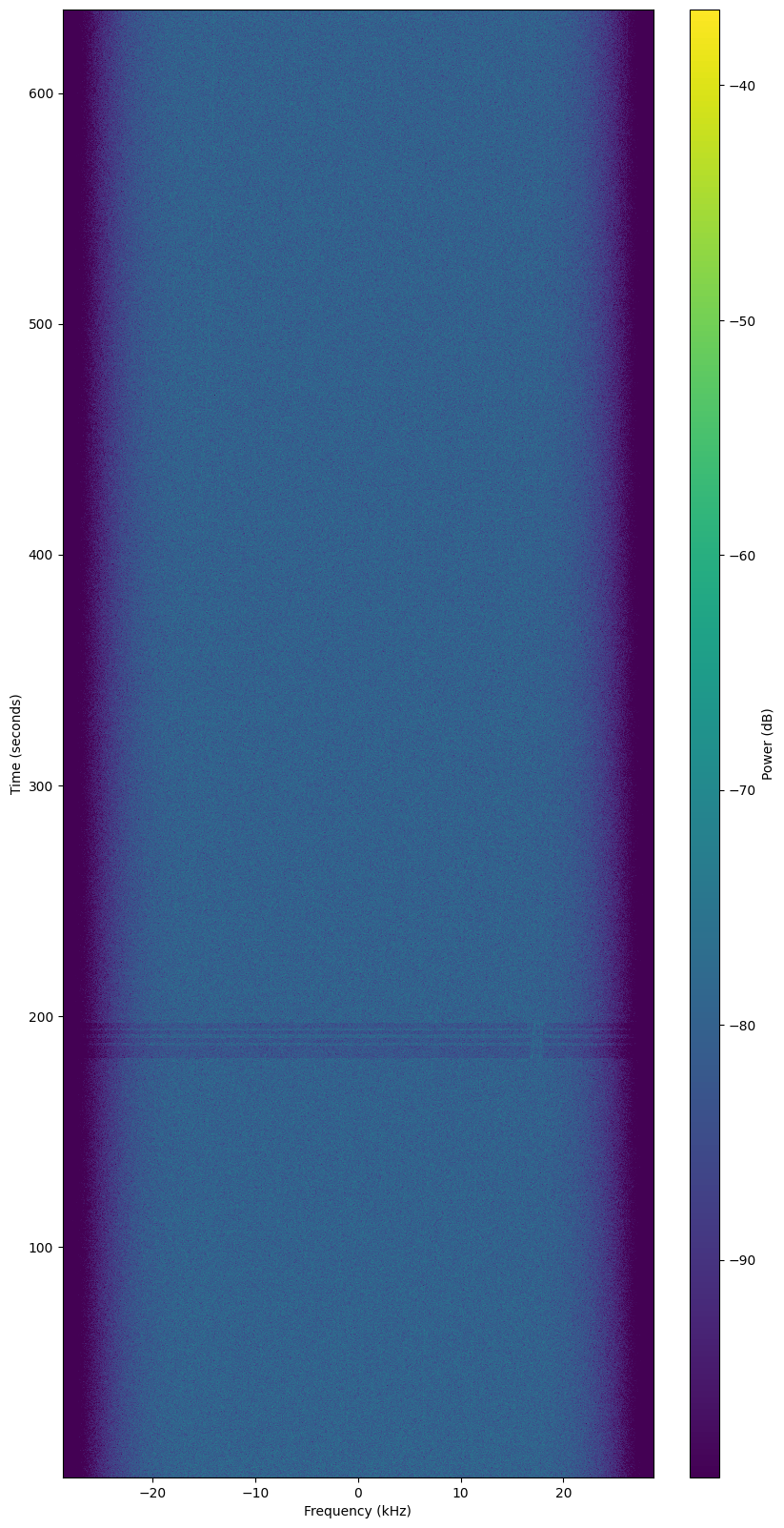
look like my station is get the faint signal:
around 215s and 275s
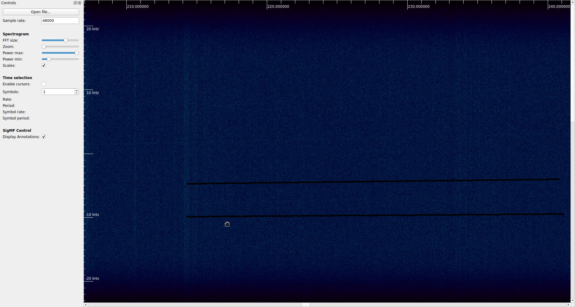
open the iq file with inspectrum:
the tle is fit with latest tle
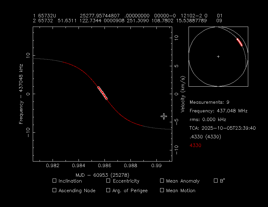
what do you think?
how to read the graphic? i try with this step:
- created a tle file in same directory contain:
0 OBJECT-XH
1 65732U 98067XL  25277.95744807  .00079735  00000-0  12102-2 0  9999
2 65732  51.6311 122.7344 0000908 251.3090 108.7802 15.53887789  2427
- and running this command:
./ikhnos.py -r 29.0 -v 12502206
result:

@fredy thank you to split and put all my post here. lol ![]()
1 Like
I’ve created a new topic to avoid spamming the other one that we can talk more on how we analyze the observations.
I can not say for sure what you see there is coming from the satellite. My doubts are coming from two details/assumptions, which could be wrong:
- The station has a dipole as antenna and the pass is low (12 degrees max), given that an omni directional antenna doesn’t performs well in such low passes even for satellites with strong signals, It makes me wonder how it made it with such a faint transmission, however it’s not impossible.
- The other one is that around 250s I can see two vertical lines one around -2KHz and the other around -5KHz, which probably means that they are coming from the same source, which is not RSP-03.
In the archive.org link I’ve sent, there are uploaded all the images, one for each candidate from this deployment. I’ve pointed to the one that shows the fit, you can navigate (left/right buttons) and see that they don’t fit.
Fit in ikhnos, in other words how to read the diagram:
The red line shows the path that the signal should follow if you used the TLE set that is checked. So if it fits the visible signal in the waterfall, that means that we have a fit, if not and it is obviously away, then we can say that it doesn’t fit and remove the TLE set from the candidates.
The purple line shows the path that a terrestrial signal should follow if visible in this waterfall, as the waterfall is doppler corrected, it should follow this strange curve.
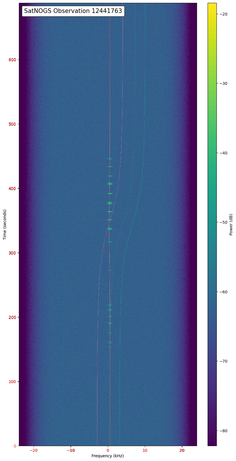
Let me give you another example:
Run this:
python ikhnos.py -r 24 -A -t ../ridusat 12441763 -f 0.6
Where ridusat file has these TLE sets:
0 OBJECT C
1 64530U 25135C   25269.88562370  .00021687  00000-0  10461-2 0  9995
2 64530  97.4452  22.7723 0005699  37.7894 322.3740 15.18698618 14853
0 OBJECT D
1 64531U 25135D   25269.88639934  .00017055  00000-0  82656-3 0  9997
2 64531  97.4544  22.8823 0005253  19.7862 340.3575 15.18585805 14858
0 OBJECT E
1 64532U 25135E   25269.29331235  .00017865  00000-0  86615-3 0  9994
2 64532  97.4550  22.2996 0005314  23.0611 337.0861 15.18561030 14764
These 3 TLE sets some weeks ago were possible candidates for RIDUSat-1. The observation is ~10 days ago, so I used above the TLE sets near that period to have more precise results.
From the results you can see that while OBJECT C (64530) is clearly off, the other two are very close to say for sure which one is it. OBJECT D (64531) seems to fit a little better than the OBJECT E (64532) which we currently follow, so I’m going to change it in DB to start following 64531.
I’m not going yet for identification as observation and ikhnos calculations introduce some errors in the results, so in order to avoid any mis-identification, I prefer to wait a little more for a clearer result.
2 Likes

