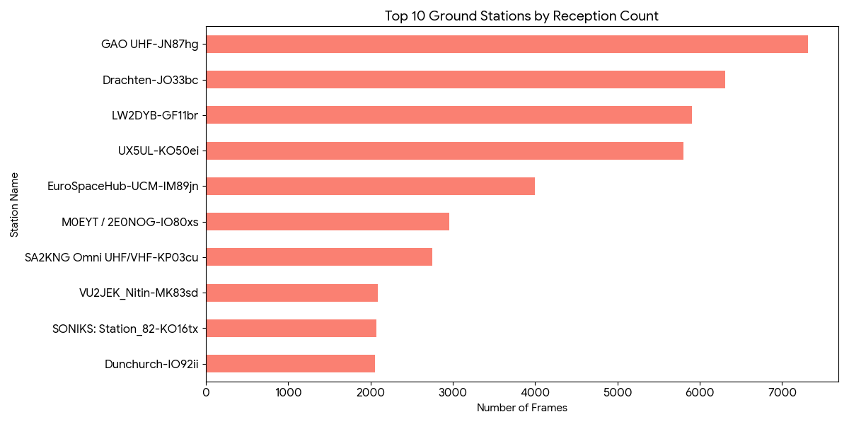
I have analyzed the telemetry data (ID: JOVH-8612-8312-2052-1559) provided by the SatNOGS community. By visualizing these extensive reception logs, I aimed to illustrate how the ground station network tracks this satellite on a global scale.
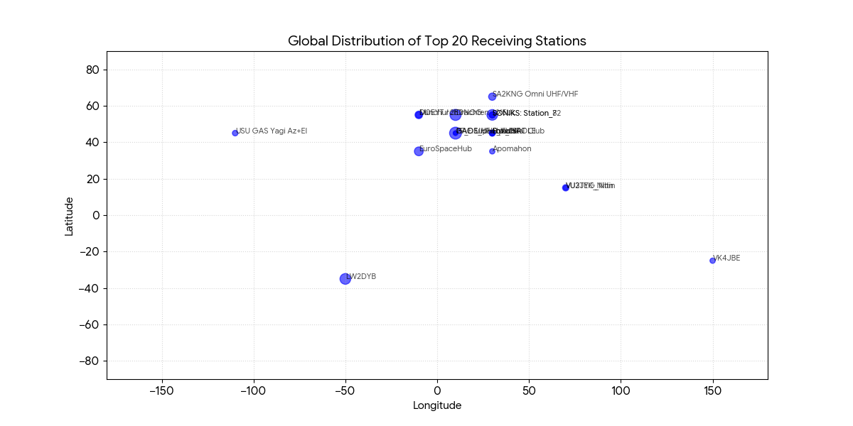
1. Global Distribution of Receiving Stations The plot below shows the geographical distribution of the top 20 receiving stations. A significant concentration of reception activity is observed across Europe, highlighting the density and coverage of the SatNOGS network in this region.
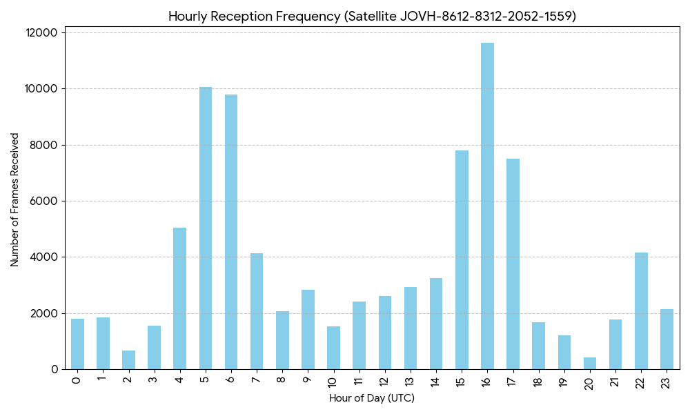
2. Hourly Reception Patterns The following chart illustrates the reception frequency over a 24-hour period (UTC). The observed peaks correlate with the satellite’s orbital passes over areas with high ground station density, reflecting the geographical bias of the current network.
3. Conclusion This data serves as a clear demonstration of how global ground stations work in a relay-like fashion to track a single satellite and build a shared, open dataset. This mechanism is a highly valuable resource for understanding satellite communications. I would like to express my gratitude to the SatNOGS team for maintaining this open-access platform.
thank you! nice information, its very nice if thereis additional menu on db.satnogs.org to view the global data… wow.. that will be very huge, large, and cool data if can show in graphical. i hope before santa claus is coming at the end of this year, there are something new on satnogs network uix
Thank you for your encouraging comment! I completely agree with you—a global, interactive dashboard on the SatNOGS database would be a game-changer for all of us in the community. It was a fascinating experience to process this data manually, but having such insights integrated into the official UI would certainly spark even more interest and collaboration. I’m also looking forward to seeing what the future holds for the SatNOGS network!
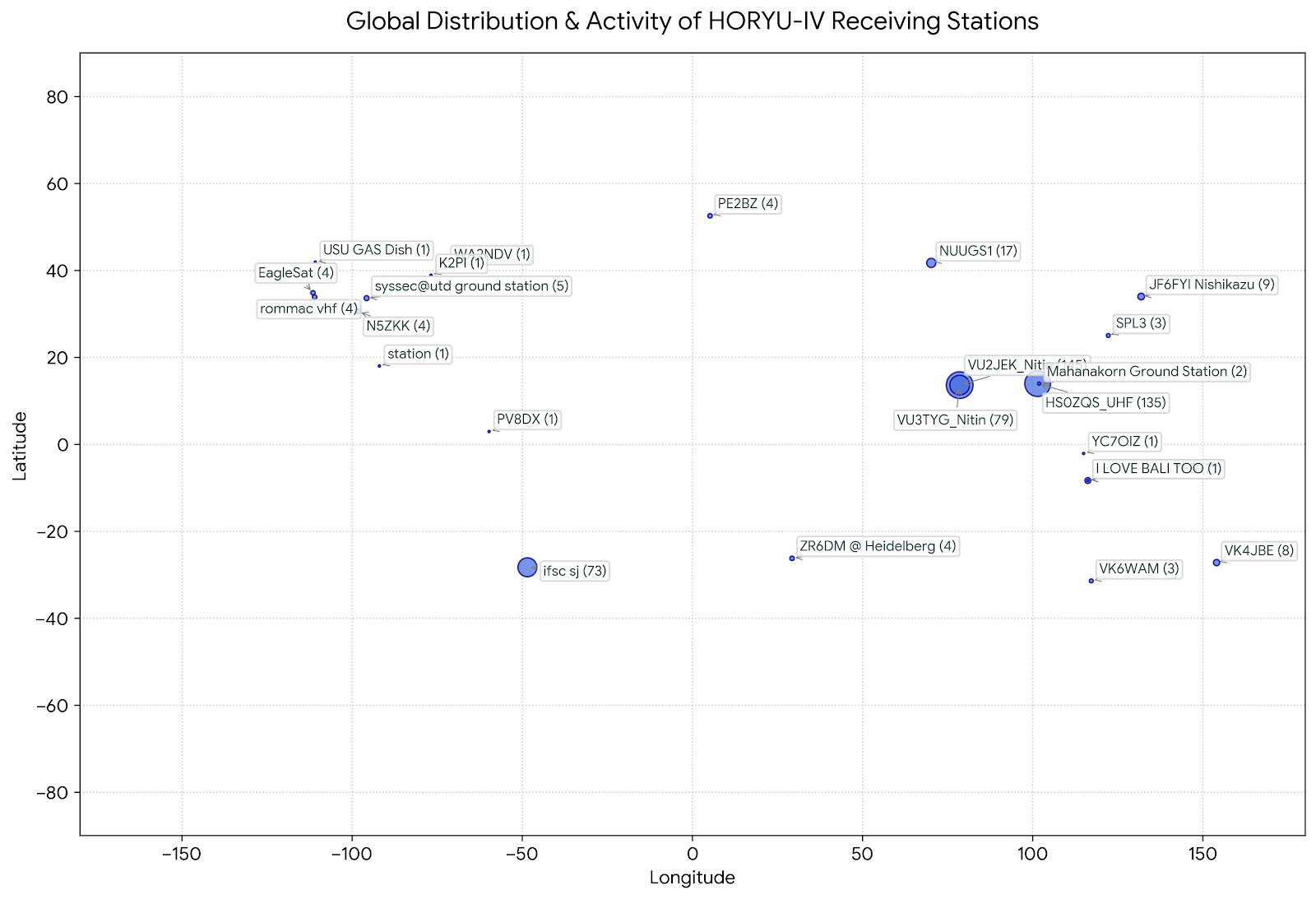
I’ve been analyzing some telemetry data for HORYU-IV (NORAD ID: 41340) downloaded from the SatNOGS DB (VJOC-8812-6508-8111-4056), and I put together a quick Python script to visualize the global distribution of the receiving stations based on their grid locators.
It’s wonderful to see stations from all over the world contributing to the observation of this satellite!
I’m sharing the station distribution map here for anyone interested. Thank you to all operators and the SatNOGS team for keeping the network running!
Data Attribution & License:
Data Source: SatNOGS Network Database
License: Creative Commons Attribution-ShareAlike 4.0 International (CC BY-SA 4.0)
Not directly related to this satellite but I have experimented with visualizing demoded data recv locations (of the satellite) in the past. This was a video I made while I was bored in a college class back in 2019 https://www.youtube.com/watch?v=1WsHWEXOqSM that shows all of Fox-1D’s demoded data between 2018-05-06 to 2019-09-18. I could probably throw together a quick site to display recv sites with data recved for any sat in a time frame. I have experience with such things. (I run https://satnogs.jwgtechs.com/ )
Thank you so much for dropping by and sharing your work! I watched your Fox-1D visualization video—it’s super impressive, and checking out your custom tracking site (satnogs.jwgtechs.com) is really inspiring.
It’s always amazing to connect with fellow makers and satellite enthusiasts in the community who enjoy playing with demodulated data and plotting tools. Thanks again for the kind words and for sharing your experience!
Thank you once again for sharing your wonderful tool! I’ve been exploring your site right away and having a fantastic time watching the satellite tracks and reception spots. It’s such an exciting way to enjoy space data from anywhere.
I agree with you, in both Network and DB we need more stats and visualizations. I want this years now… but unfortunately the current development time is not enough to cover this as it is hardly enough for maintenance and some crucial new features.
If anyone is interested to start building such stats either in satnogs-db or satnogs-network project (needs some python and django knowledge, plus html-css-javascript), let me know and I’ll try to help in order to implement them. We can start with something simple and then build on it.
Also getting the data directly from the database of each projects, It will make it easier, maybe with more detailed data and better performance than getting the data from the API.
Nice analysis — the Europe concentration you found matches what I see live: I run a map of SatNOGS receptions for the ~23 open-telemetry cubesats (https://overwatch.confinia.io, discussed in the control-room thread), and the station density gradient is just as striking in real time.
If it helps a next iteration: the site exposes free API endpoints with per-station reception aggregates over the tracked fleet — GET /api/v1/stations (frames, satellites heard, last reception per station, 7-day window) and /api/v1/stations/{callsign} for one station’s log. Might save the raw log crunching for this kind of study. Same CC-BY-SA data, attributed the same way you did.
Thank you so much for dropping by and sharing such insightful comments!
Seeing your overwatch.confinia.io project and realizing that the Europe concentration isn’t just an illusion on my end gave me a real “frog in a well” (井の中の蛙) moment—a bit of cold sweat mixed with great excitement!
Also, thank you immensely for pointing out the API endpoints (/api/v1/stations). That is going to save me a huge amount of log-crunching effort for the next iteration. It’s wonderful to learn from someone running live tracking like you.
Great visualization of data coming from the SatNOGS network database!
In addition, and in case there is a kaitai decoder linked to the satellite, there is also data available in the Grafana database for dashboards.
You may use Geomaps to visualize the locations of stations and the satellite itself.
Examples: ISS digipeater (locations of observers and APRS digipeating stations) SPIRONE (locations of beacon observers) SNUGLITE (positions of the satellite).
Thank you so much for the kind words and for pointing me toward Grafana and Geomaps!
I hadn’t thought about utilizing the Grafana database and Geomaps for this kind of visualization yet. Checking out the examples you shared (ISS, SPIRONE, SNUGLITE) gives me so many great ideas for the next steps.
I really appreciate everyone in this community being so generous with such valuable tips. Thanks again!